How to Style a Console Without Overdoing It
Most console tables hold too much. Three objects, two heights and one empty third is all it takes to style a console well.
An editorial piece on proportion and arrangement. No products are reviewed or tested here.
A console table is a shelf with ambitions, and that is exactly what gets people into trouble. It sits at eye level in a hallway or behind a sofa, it has a flat empty top, and within a month it is holding keys, three candles, a tray, a small plant, a bowl of something and a framed photo nobody looks at.
The fix is subtraction, and it follows a pattern simple enough to apply in ten minutes.
Three objects, not seven
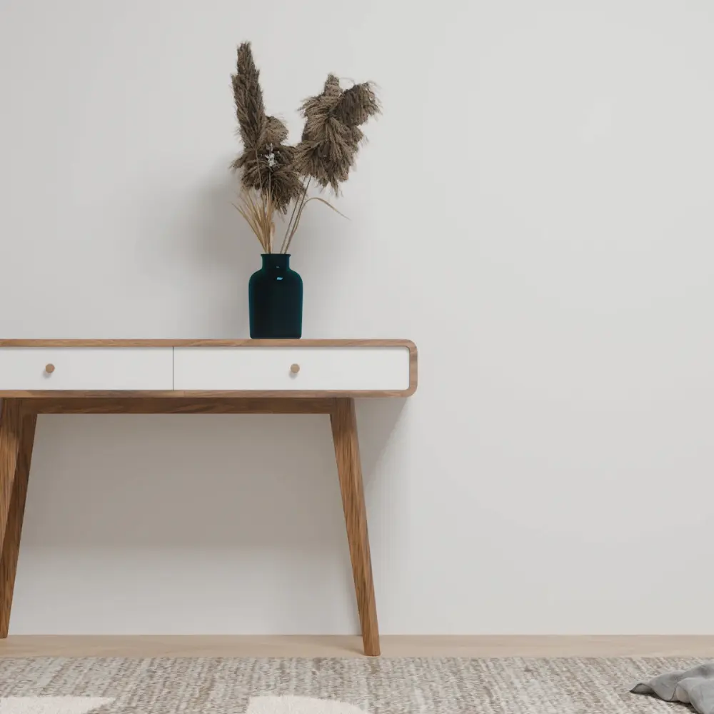
The usable rule is to style a console with three things and stop. One tall, one medium, one low and wide. A lamp, a stack of two books, a shallow dish.
Three works because the eye reads it as a composition rather than a collection. At five objects it becomes a display, and at seven it becomes storage with a nicer name.
Leave a third of it empty
The most common console table styling mistake is filling the full length. Objects spread evenly across a surface flatten it, and nothing has anywhere to breathe.
Group the three items toward one end or the centre and leave roughly a third of the top genuinely bare. That empty stretch is doing work. It is what makes the occupied part look deliberate rather than accumulated.
If the console sits in a hallway, the bare third is also where keys and post land. Give the mess a designated corner and the rest of the surface stays intact.
Get the heights right
- The tallest object should reach roughly two thirds the height of whatever hangs above, so a tall lamp under a low mirror will always look cramped.
- Keep the shortest object low and wide, since three tall things in a row read as a skyline rather than a group.
- Hang art or a mirror about six to eight inches above the surface, close enough that the two read as one unit.
- Let one object overlap the edge of what is behind it slightly. Perfect centring is what makes a hallway look like a showroom.
What to actually put on it
Useful beats decorative every time. A working lamp, because a hallway with a lamp is a different place after dark. Books you have read. A dish for the things you empty out of your pockets.
What to avoid is the standard shopping list of console table styling props, which is to say faux stems, a stack of coffee table books nobody opens and a decorative box with nothing in it. They photograph well and they make a surface feel like a prop table.
The test is simple enough. If you can style a console and still use it without moving anything, you have got it right. If you have to clear a space before you can set a cup down, there is one object too many.
An editorial piece on proportion and arrangement. Heights and spacing given here are general design conventions rather than fixed rules, and the right numbers depend on your ceiling, your mirror and your hallway.